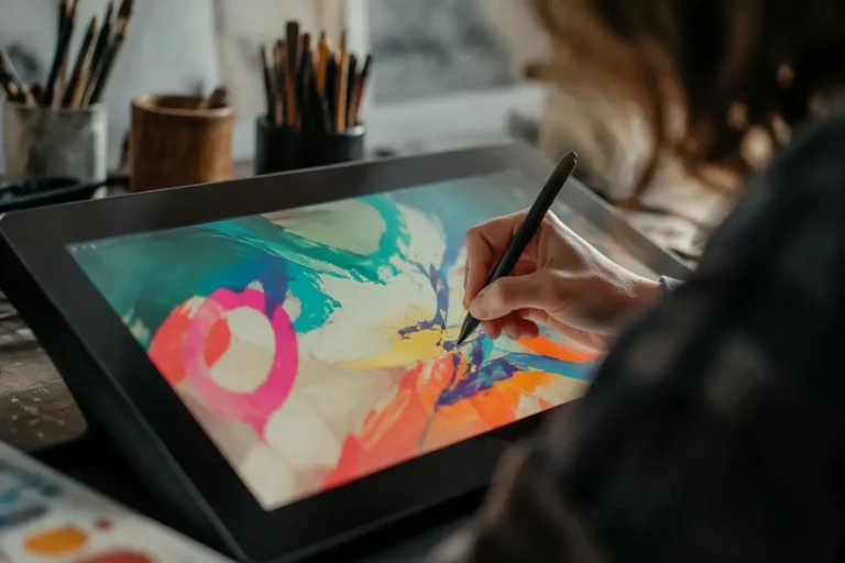
AI image generation is the most immediately magical of all the AI skills. You describe a picture, and seconds later, it exists. Wow. But here’s what nobody warns you about: it’s also where beginners hit a wall fastest. The gap between “a dog on a beach” (generic, glossy, vaguely wrong) and a usable, specific, on-brief image is a genuine skill gap. The good news? It’s a learnable one. This guide closes it: which tool to start with, how to write prompts that actually deliver, how to fix the almost-right image, and how to stay on the right side of usage rights.
Key takeaways
- Start inside ChatGPT if you have it; graduate to Midjourney for aesthetics.
- Build prompts in layers: subject, context, composition, light, style.
- Edit regions instead of regenerating; add text in a design tool.
- Character and style references unlock series work.
- Commercial rights need a paid plan, and your judgment is the real differentiator.
Step one: pick your first tool
Three starting points cover most beginners. Already have ChatGPT? Its built-in image generation is the gentlest on-ramp: you describe and refine in conversation, and it follows detailed instructions well. Midjourney produces the most beautiful defaults and has a friendly web app; its strength is aesthetics, and its learning curve is mostly learning to argue with its taste (it has taste, and it will use it). Free options exist across the ecosystem and suffice for learning. When you outgrow your first tool, our full image generator comparison maps the whole territory.
The anatomy of a good image prompt
Here’s the core insight: weak prompts name a subject; strong prompts describe a photograph. Work through five layers. Subject: not “a woman” but “a baker in her fifties, flour on her hands, mid-laugh.” Action and context: “kneading dough in a small village bakery.” Composition: “shot from the side, shallow depth of field, 35mm.” Light: “warm morning light through a window.” Style: “editorial photography” versus “flat illustration” versus “watercolor,” and this layer changes EVERYTHING.
Feel the pattern? Each layer you add removes the model’s freedom to disappoint you. Lazy prompt, lottery ticket. Layered prompt, controlled outcome.
Style vocabulary that actually works
Models respond to concrete visual references, not vague adjectives. “Beautiful” does nothing. “Golden hour backlight, soft shadows” does. Camera language works well for photorealistic styles: lens, aperture, film stock. Art language works for illustration: “flat vector illustration, limited palette of navy and coral.” And a quick word on artist names: they’re effective but raise ethical questions many users prefer to avoid. Describing the style’s properties (“in the style of 1970s travel posters, bold shapes, grain texture”) achieves the same effect by description, no names needed.
Iteration: how professionals actually work
Want the truth? Nobody gets the final image in one prompt. Nobody. The real workflow: generate four variants from your best prompt, pick the closest, and refine with specific feedback. In ChatGPT you simply say what to change: “same scene, but dusk lighting and no people.” In Midjourney you vary and upscale toward the winner. Expect three to five rounds, and keep a notes file of prompts that worked. Your personal prompt library becomes a genuine asset within weeks.
Fixing the almost-right image
The image is perfect… except the hand. Or the sign. Or the background. Don’t regenerate from scratch; edit. Inpainting tools, present in ChatGPT’s editor, Midjourney and every serious platform, let you select the offending region and regenerate only it. For text in images, stop fighting the models: they render short text unreliably, full stop. Generate the image without text and add typography in Canva. And for consistent characters across a series, use character reference features in Midjourney or seed control in Stable Diffusion. That consistency question is one of the reasons series work graduates people to those tools.
Prompt recipes worth stealing
Take these structures and adapt the bracketed parts. Editorial photo: “[subject] [doing action], [setting], shot on 35mm, shallow depth of field, warm natural window light, editorial magazine photography.” Product shot: “[product] on [surface], studio lighting, soft shadows, minimalist background in [color], professional e-commerce photography.” Flat illustration: “[scene or concept], flat vector illustration, limited palette of [two or three colors], clean geometric shapes, generous negative space.” Whiteboard sketch: “[concept] as a hand-drawn whiteboard diagram, black marker on white, simple arrows and boxes, slightly imperfect lines.”
Two habits multiply the value of any recipe. Keep a personal prompt library: when an image delights you, save the full prompt WITH the result, because your future self will want that exact lighting again. And steal structure, not just words: when you see an AI image you admire, describe it to yourself using the five-layer anatomy, and notice which layers did the work. That reverse-engineering instinct is the difference between collecting prompts and understanding them.
Rights, disclosure and taste
The unglamorous but essential part. Paid plans on the major tools grant commercial usage rights; free tiers often restrict them. Copyright law around AI images varies by country and keeps evolving, so the safe professional practice is adding meaningful human creative input (editing, compositing, art direction) and keeping records of your process. Disclose AI imagery where your audience would feel deceived. And exercise taste: the internet is drowning in glossy generic AI images. The differentiator is no longer generation. It’s judgment.
Beginner mistakes to skip
- One-word prompts, then concluding the tool is limited.
- Regenerating from scratch instead of editing regions.
- Fighting for rendered text instead of adding it in an editor.
- Using the first image instead of the fourth variant.
- Forgetting that real photos of your actual product still outperform any generation for authenticity.
Your first-week plan
Day one: generate twenty images with lazy prompts to see the baseline. Day two: apply the five-layer anatomy to the same subjects and compare (prepare to grin). Day three: practice region editing. Day four: attempt a consistent character or style across five images. Day five: produce one image good enough to actually use somewhere, and use it. Publicly. That last step matters more than the other four combined.
How we write image guides. We generate every technique described here across the major tools before recommending it, on real briefs from our own content work. Tools mentioned here are covered hands-on in our comparisons section. Protocol on our methodology page.
The bottom line
Remember that wall between “a dog on a beach” and an image worth publishing? It’s not a wall anymore. It’s five layers, an edit button and a prompt library away. One last discipline pays outsized returns as you grow: consistency across a body of work. Pick two or three style recipes and reuse them until they become your visual signature, because audiences recognize consistency at a glance, and that recognition is brand equity no single perfect image provides. Next stop: our design tools roundup shows how images fit into complete design workflows. Now go make something you’d actually hang on a wall.